On This Page
A good mobile landing page puts the headline, offer and button on the first screen, keeps the copy short and scannable, uses a single column, makes buttons large and easy to reach with a thumb, keeps forms to as few fields as possible, and loads quickly on mobile data. Design it for the phone first, then adapt it for larger screens.
Mobile visitors are often distracted and on the move. Every extra second, field or scroll is a chance for them to leave.
Mobile Page Essentials
- Headline, offer and button on the first screen
- Single-column layout
- Large, well-spaced buttons
- Short forms with the right keyboard types
- Compressed images and few scripts
- Click-to-call for service businesses
Designing for the Thumb
Many people use their phones one-handed, so where you put buttons matters. Interaction research suggests people tap most accurately toward the center of the screen, and the far top corners are hardest to reach. Keep primary buttons in the middle or lower part of the screen, and avoid tiny links near the edges.
| Element | Desktop Habit | Mobile Approach |
|---|---|---|
| Layout | Multiple columns | One column |
| Button | Top-right of header | Full-width or large button mid-screen |
| Navigation | Menu bar | Remove it on landing pages |
| Forms | Many fields side by side | Few fields stacked, or a multi-step form |
| Images | Large backgrounds | Compressed, cropped for portrait screens |
| Copy | Longer paragraphs | Short paragraphs, bullets, clear subheadings |
Mobile Forms
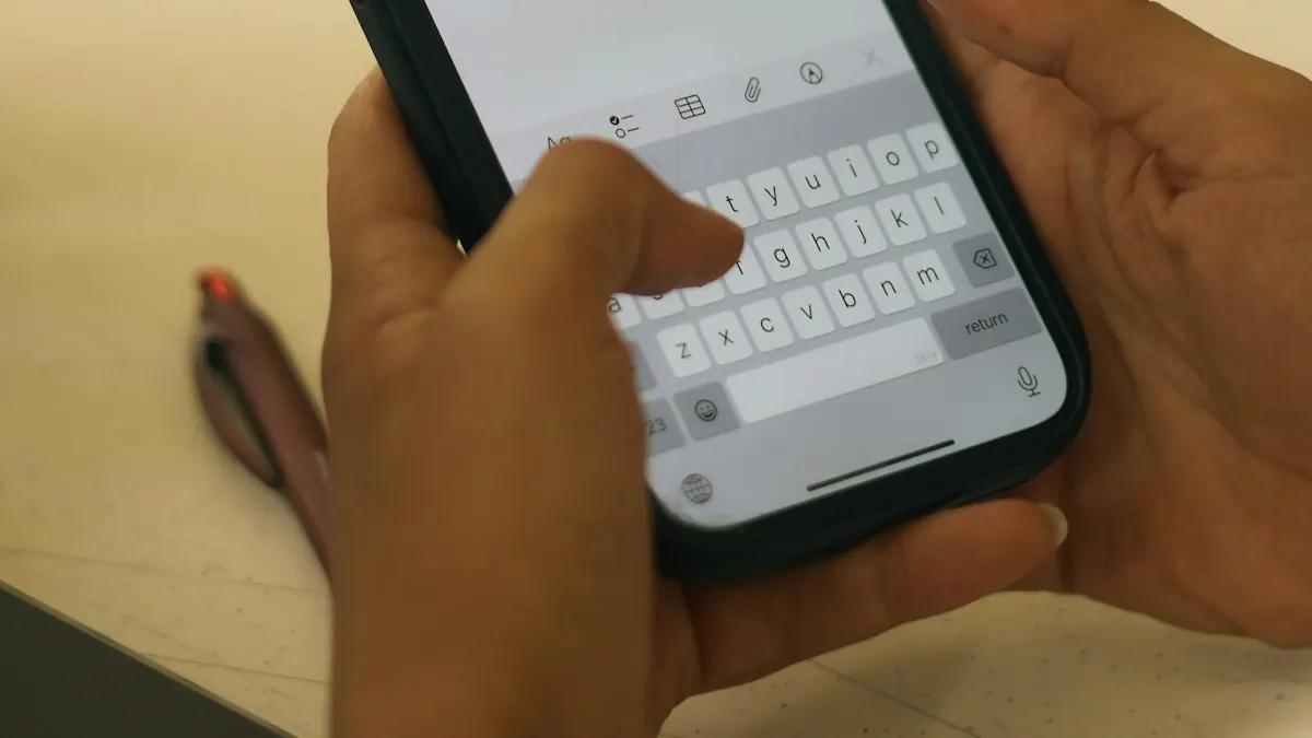
Forms are where mobile visitors most often give up. Typing is slow and the keyboard covers half the screen.
- Ask for less: every field you remove makes the form easier to complete.
- Use the right input types so phones show a number pad for phone numbers and an email keyboard for emails.
- Enable autofill with standard field names.
- Use large fields and labels that stay visible.
- Consider multi-step forms for longer forms, starting with an easy question.
- Show clear error messages next to the field that needs fixing.
Our landing page forms guide covers form design in more detail.
Speed on Mobile Networks
Phones on cellular connections feel slow pages more than desktops on Wi-Fi. Compress images, avoid autoplay video, limit third-party scripts and test on a real phone using mobile data. Our landing page speed guide explains Core Web Vitals and the fixes that matter most.
Build mobile-friendly pages from responsive templates and preview them on any screen size before you publish. Try Leadpages for 7 days.
Try LeadpagesMobile-Specific Features
Click-to-Call
For local and service businesses, a tap-to-call button often beats a form.
Sticky Button Bar
A button pinned to the bottom of the screen keeps the action within reach on long pages, as long as it doesn't hide content.
Tap-to-Expand FAQs
Collapsible answers keep pages short while still answering questions.
Wallet Payments
For checkout, support the payment methods mobile buyers prefer where your payment provider allows.
Pop-Ups on Mobile
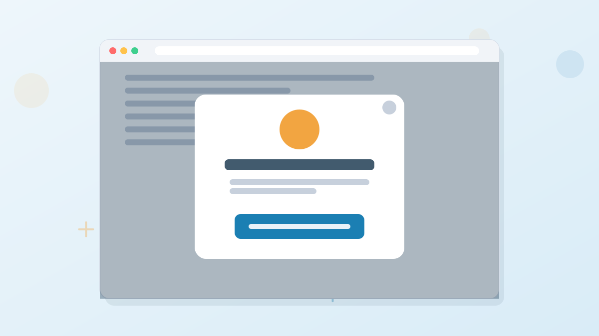
Pop-ups that cover the whole screen as soon as a visitor arrives frustrate mobile users and can conflict with Google's guidance on intrusive interstitials. On mobile, use smaller, well-timed pop-ups or banners, and make the close button easy to tap.
Writing for Small Screens
- Lead with the benefit, since fewer words fit on the first screen.
- Use short paragraphs of two or three sentences.
- Break up content with descriptive subheadings and bullets.
- Front-load buttons with clear, short labels that fit on one line.
Common Mobile Problems and Fixes
| Problem | What Visitors Experience | Fix |
|---|---|---|
| Text too small | Pinching and zooming to read | Body text around 16 pixels or larger |
| Buttons too close together | Tapping the wrong link | Larger tap areas with space between them |
| Wide tables or images | Sideways scrolling | Stack content or make tables scroll inside their own area |
| Form fields hidden by keyboard | Losing their place | Short forms and fields that scroll into view |
| Sticky elements covering content | Can't read or tap | Keep sticky bars slim and test on small screens |
| Slow hero image | Blank screen | Smaller, compressed image for mobile |
Copy That Works on Small Screens

Example: Desktop Versus Mobile Intro
Desktop: A three-sentence introduction explaining the problem, the solution and who it's for, beside a form.
Mobile: A one-line headline, a one-sentence subheadline, the button, then three bullets. The longer explanation moves below the button for those who want it.
The message stays the same; only the order and length change so the essentials fit on the first screen.
Mobile Analytics to Watch
Segment your analytics by device. If mobile conversion rate is far below desktop for the same traffic source, look at speed, form usability and how much of the page fits on the first screen.
Testing Mobile Pages
Preview every page on a real phone before launching, both iPhone and Android if possible. Check that text is readable without zooming, buttons are easy to tap, forms show the right keyboards and nothing overflows the screen. If you have the traffic, test mobile-specific changes, since what works on desktop doesn't always work on phones.
Mobile Landing Pages FAQs
What makes a good mobile landing page?
A first screen with the headline, offer and button, a single column, large buttons, short forms and fast loading.
Should mobile landing pages be shorter than desktop pages?
Often, yes, but they still need to answer key questions. Use collapsible sections and clear subheadings to keep them scannable.
Where should the button go on a mobile landing page?
On the first screen and repeated through the page, in an easy-to-reach area, often mid-screen or in a sticky bottom bar.
Are pop-ups bad on mobile?
Full-screen pop-ups that appear immediately can frustrate users. Smaller, well-timed pop-ups with easy closing work better.
Are Leadpages pages mobile-friendly?
Yes. Leadpages templates are responsive, and you can preview and adjust pages for mobile before publishing.