On This Page
- Visual Hierarchy: What Gets Noticed First
- What Goes Above the Fold
- Common Layout Patterns
- Color and Contrast
- Images and Video
- Typography and Readability
- Designing for Mobile First
- Design Mistakes to Avoid
- Section Order That Works for Most Pages
- Design Choices by Page Type
- Using Templates
- Landing Page Design FAQs
Good landing page design guides the visitor's eye in a deliberate order: headline first, then the key benefit or visual, then the call to action, then the supporting detail. You create that order with size, contrast, spacing and position. A strong design also keeps one goal, removes distractions such as site navigation, works on a phone first and loads quickly.
Write the words before you design. Layout should serve the message, and no design can rescue an unclear offer.
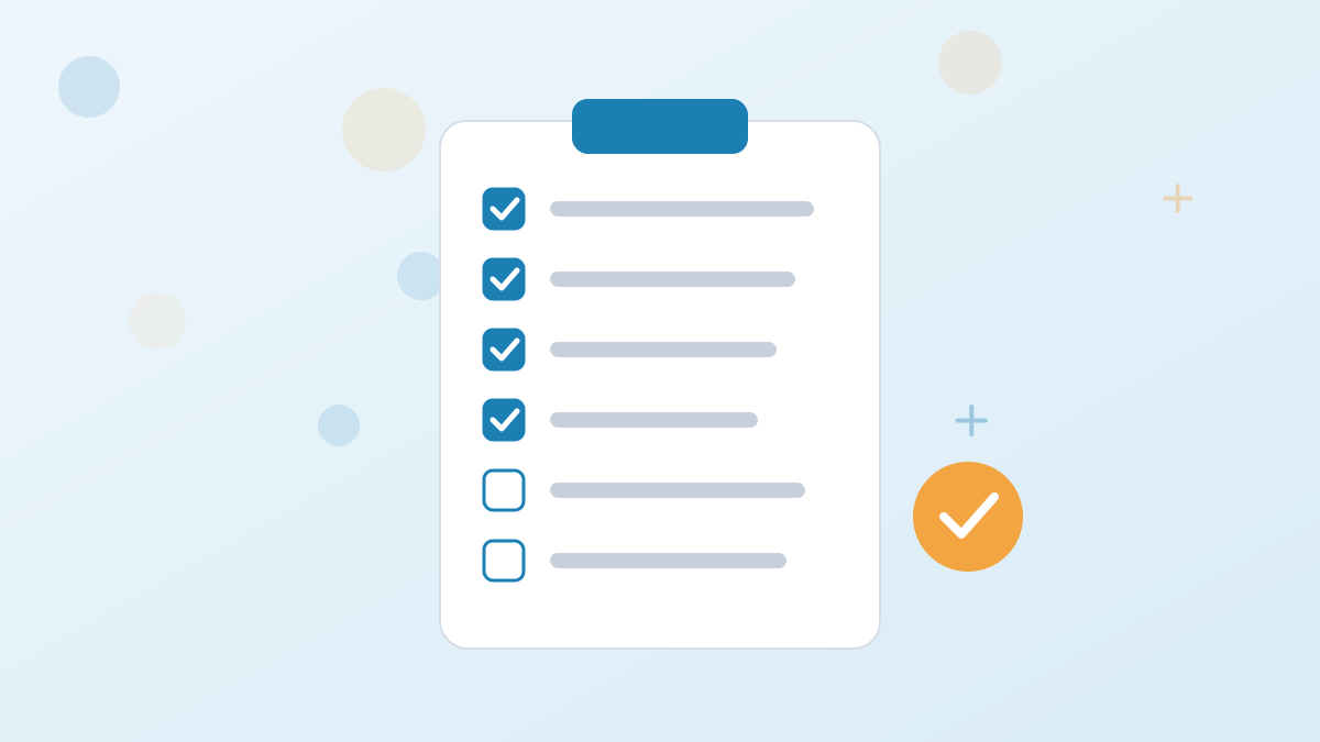
The Design Checklist
- One clear goal and one primary button
- A visual hierarchy: headline, benefit, button
- The essentials above the fold
- Plenty of white space
- Images that show the product or outcome
- A single-column flow on mobile
Visual Hierarchy: What Gets Noticed First
Visitors scan before they read. Hierarchy decides what they notice in those first seconds.
| Tool | How It Works | Example |
|---|---|---|
| Size | Bigger elements are seen first | A large headline and button |
| Contrast | Elements that differ from surroundings stand out | A button in an accent color on a light page |
| Position | Top and left get noticed first in left-to-right languages | Headline at the top, form beside it |
| White space | Space around an element draws attention to it | Generous padding around the button |
| Direction | Lines, arrows and gaze lead the eye | A photo of a person looking toward the form |
Test your hierarchy with a squint: blur your eyes at the page. The headline and button should still stand out.
What Goes Above the Fold
"Above the fold" means what's visible before scrolling. It doesn't have to contain everything, but it must make visitors want to keep going or act now.
- Headline stating the outcome.
- Supporting line explaining how or for whom.
- A visual of the product, outcome or person.
- The call to action, or a clear cue to scroll for it.
- A trust signal such as a short testimonial or rating, if genuine.
On longer pages, visitors scroll happily when the first screen promises something worth reading. Our headline guide covers how to write that first line.
Common Layout Patterns
Hero With Form
Headline and benefits on the left, form on the right. Good for lead capture pages.
Single Column
Content stacked in one column, ideal for mobile and long sales pages.
Z-Pattern
Short pages where the eye moves across, diagonally, then across again.
Alternating Sections
Benefit rows with image and text alternating sides, common for products and software.
Color and Contrast
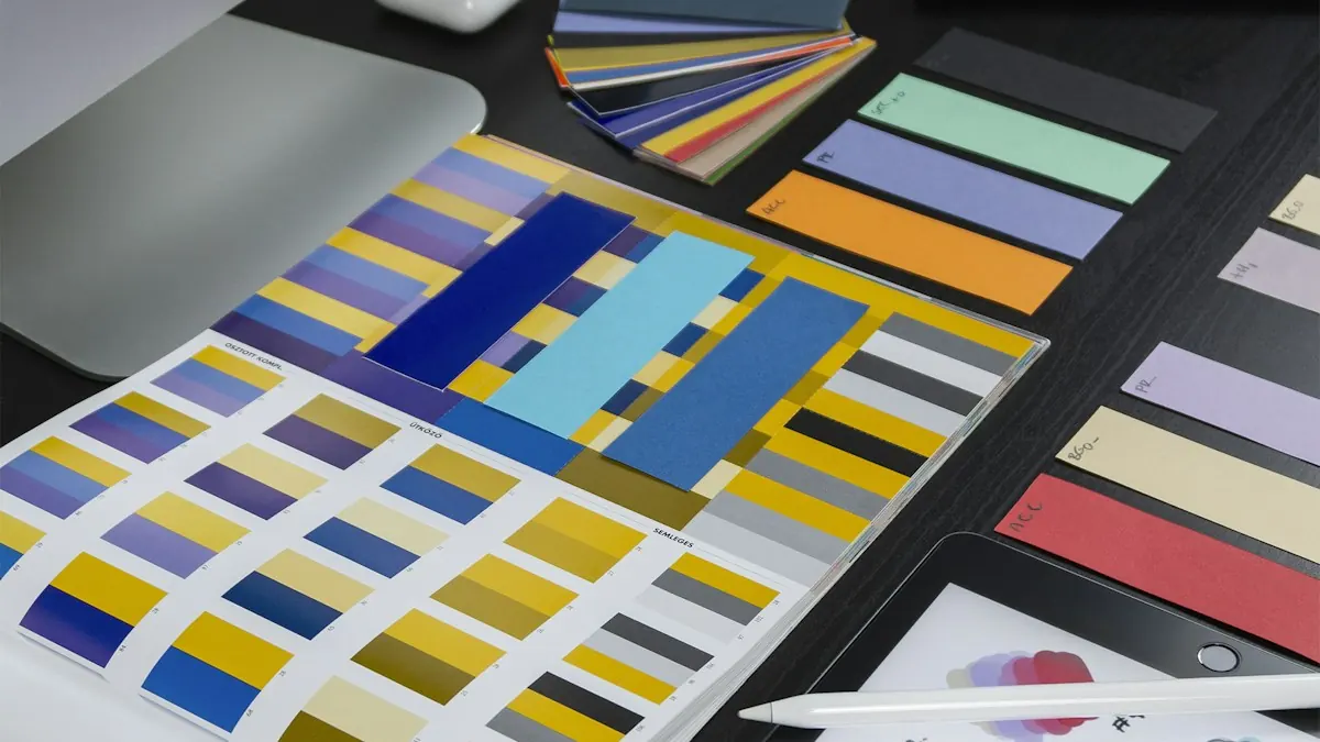
Choose a limited palette: a background, a text color and one accent color reserved for calls to action. When only the buttons use the accent color, visitors learn where to click. There's no single best button color; contrast with the surroundings matters more than the hue. Our call-to-action guide covers button design in detail.
Images and Video

Use images that show something real: the product, the outcome or the people behind the business. Generic stock photos add little. A short video can explain a complex product quickly, but compress it, and don't let it delay the headline and button from appearing.
Typography and Readability
- Body text around 16 to 18 pixels on most screens.
- Short paragraphs and descriptive subheadings.
- High contrast between text and background.
- Two typefaces at most, one for headings and one for body text.
Start from a conversion-focused template, apply your brand colors and fonts, and publish a page that works on every screen. Try Leadpages for 7 days.
Try LeadpagesDesigning for Mobile First
Most landing page traffic arrives on phones. Design the single-column mobile version first, then adapt for desktop. Keep tap targets large, forms short and the button within easy reach. Our mobile landing pages guide goes deeper.
Design Mistakes to Avoid
- Multiple competing buttons for different goals.
- Site navigation that leads visitors away.
- Walls of text without subheadings.
- Low-contrast text that's hard to read.
- Heavy images that slow the page.
- Design that doesn't match the ad, breaking the visitor's sense of continuity.
Section Order That Works for Most Pages
- Hero: headline, subheadline, visual and button.
- Problem: a short section showing you understand the visitor's situation.
- Benefits: three to five benefits with icons or images.
- How it works: three simple steps.
- Proof: testimonials, logos or results.
- Offer details: what's included and price if relevant.
- FAQ: the questions that stop people acting.
- Final call to action: repeat the button with a short summary.
Shorter pages can drop sections; longer sales pages expand them. The order follows the questions visitors ask: what is this, is it for them, how does it work, can they trust it and what happens next.
Design Choices by Page Type
| Page Type | Design Emphasis |
|---|---|
| Lead magnet | Image of the freebie, short form near the top |
| Webinar | Date and time prominent, host photo, agenda |
| Sales page | Long single column, repeated buttons, proof throughout |
| SaaS trial | Product screenshot or video, one primary button |
| Local service | Phone button, service area, photos of real work |
Using Templates
Templates give you a proven layout to start from, so you can focus on your message. Leadpages includes more than 160 templates organized by goal, and the AI builder can draft a layout from a description of your offer. Our Leadpages templates guide shows how to choose one.
Landing Page Design FAQs
What makes a good landing page design?
A clear visual hierarchy, one goal, the essentials above the fold, plenty of white space, real images and a mobile-first layout.
What should be above the fold on a landing page?
The headline, a supporting line, a relevant visual, the call to action or a cue to scroll, and a genuine trust signal if you have one.
What color should a landing page button be?
Choose a color that contrasts with the page and use it only for calls to action. Contrast matters more than the specific hue.
Should landing pages be long or short?
It depends on the offer. Simple, low-cost offers suit short pages; complex or expensive offers need more detail.
Do you need a designer to create a landing page?
Not usually. Templates and builders handle layout, so you can focus on copy and offer.