On This Page
A squeeze page, also called an opt-in page, is a short landing page with one goal: getting a visitor's email address, usually in exchange for a free resource such as a checklist, guide or mini-course. It typically has a headline, a few benefit points, an image of the offer and an email field, with no navigation or other links.
The name comes from the idea of "squeezing" out everything except the sign-up. Because the ask is small and the offer is free, squeeze pages can convert a high share of visitors when the offer is right.
The Essentials
Goal: collect an email address.
Length: short, often a single screen on desktop.
Offer: a specific, quick-to-use freebie.
Must-haves: a benefit headline, 3 to 5 bullets, one field and a clear button.
Squeeze Page vs Other Landing Pages
Every squeeze page is a landing page, but not every landing page is a squeeze page.
| Squeeze Page | Lead Generation Page | Sales Page | |
|---|---|---|---|
| Goal | Email address | Contact details for follow-up | A purchase |
| Form | Email only, sometimes name | Several fields | Checkout |
| Length | Short | Medium | Long |
| Offer | Free resource | Quote, consultation, demo | Paid product |
If you need a phone number or company details for sales follow-up, you want a lead generation page rather than a squeeze page.
The Parts of a Squeeze Page
Effective squeeze pages share the same few parts, in roughly this order.
- Headline. Names the specific benefit of the freebie, such as "Plan a Week of Healthy Dinners in 20 Minutes."
- Subheadline. Adds what it is and who it's for: "A free printable meal planner for busy parents."
- Image of the offer. A cover, mockup or preview makes the freebie feel real.
- Benefit bullets. Three to five specific things the visitor will get or be able to do.
- Form. An email field, and a first-name field only if you'll use it.
- Button. Text that names the reward: "Send Me the Planner."
- Small trust line. A brief note on what happens next and that they can unsubscribe anytime.
That's it. Resist adding more sections. The page should be readable in under a minute.
Choosing the Right Offer
The offer does most of the work. A great page can't rescue a weak freebie, but a strong freebie can succeed on a plain page.
Good squeeze page offers share three traits. They solve one specific problem, they deliver value quickly, and they connect naturally to what you sell.
Checklists and Cheat Sheets
Quick to use and easy to understand. Great for practical topics.
Templates and Swipe Files
Save the visitor real time, like a budget template or email scripts.
Mini-Courses
A short email course over five days builds trust as it delivers.
Discounts
For ecommerce, a first-order discount is a simple, effective offer.
Our lead magnet ideas guide has more formats and examples by industry.
Writing the Copy
Squeeze page copy should be short, specific and focused on the outcome.
Lead with the result. "Write Your First Sales Email in 15 Minutes" beats "Free Email Marketing Guide." The visitor wants the result, not the document.
Make bullets concrete. "The 3-line opening that gets replies" is better than "Great email tips." Specific bullets make the freebie feel more valuable.
Name the button. Replace "Submit" with what they get: "Get the Free Template."
Match the source. If the visitor clicked an Instagram post about meal planning, the headline should talk about meal planning, using similar words.
Our landing page copywriting guide goes deeper on headlines and bullets.
An Illustrative Example
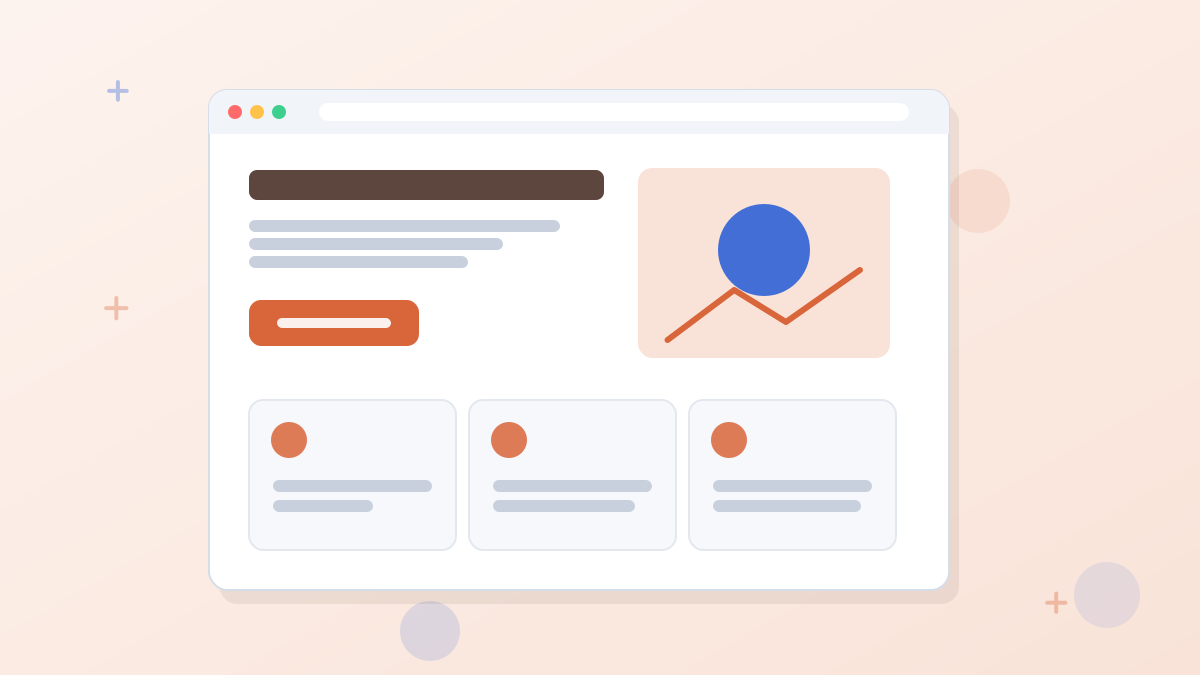
Here's what a complete squeeze page might look like for a personal finance blogger. The details are illustrative.
Example: A Budget Template Squeeze Page
Headline: Take Control of Your Money in One Sunday Afternoon
Subheadline: A free, fill-in-the-blanks budget spreadsheet for first-time budgeters.
Bullets: See exactly where your money goes each month. Spot three easy savings in under ten minutes. Plan for irregular bills so they never surprise you.
Form: First name and email.
Button: Send Me the Budget Template
Trust line: You'll get the template by email right away, plus our weekly money tips. Unsubscribe anytime.
Notice there's no navigation, no blog links and no second offer. Every element supports the single action.
Adding a Pop-Up as a Second Chance
Some visitors leave before deciding. An exit-intent pop-up offering the same freebie, or a smaller version of it, can catch them. Click-triggered pop-ups also work well on blog posts, where a button opens the opt-in form.
Use one pop-up, not several, and make it easy to close. Our exit-intent pop-up guide explains how to do this without annoying people.
After the Sign-Up
What happens next matters as much as the page. Send new subscribers to a thank-you page that confirms the sign-up and delivers the freebie or explains when it will arrive. Then send a welcome email within minutes, while interest is high.
This is also where many businesses suggest a next step, such as joining a webinar or booking a call, while the subscriber is engaged.
Common Squeeze Page Mistakes
Most underperforming squeeze pages share one of these problems.
- A vague offer. "Join our newsletter" gives no reason to sign up. Name a specific, useful freebie.
- Too much text. A squeeze page isn't a sales page. If visitors have to scroll through paragraphs to find the form, many won't.
- A mismatched headline. If the ad promised a meal planner, the page shouldn't open with your brand story.
- Too many fields. Asking for a phone number for a free checklist loses sign-ups for little gain.
- No follow-through. If the freebie doesn't arrive quickly, new subscribers forget why they signed up and may mark your emails as spam.
Measuring Your Squeeze Page
Track the share of visitors who sign up, your conversion rate. Then look beyond it. A page that converts well but attracts subscribers who never open your emails isn't really working.
Watch three numbers together: the sign-up rate, the open rate of your welcome email and how many subscribers take your next step, such as booking a call or buying. If sign-ups are high but engagement is low, the offer may be attracting the wrong audience. If engagement is strong but sign-ups are low, the page or the traffic source is the place to improve.
On Leadpages Grow and higher, A/B testing two headlines is an easy first experiment. Our A/B testing guide explains how to run a fair test.
Building a Squeeze Page
You can build a squeeze page with most landing page builders and many email platforms. A dedicated builder usually makes it faster and gives you more control over design, pop-ups and testing.
In Leadpages, opt-in templates are built for exactly this job, and the AI builder can draft one from a short description of your freebie. Forms and pop-ups with exit-intent, timed, scroll and click triggers come on every plan, and leads can flow straight into your email tool. On Grow and higher, you can A/B test headlines to see which promise attracts more sign-ups.
Build a squeeze page for your freebie in minutes. Leadpages includes opt-in templates, pop-ups and email integrations on every plan.
Try LeadpagesSqueeze pages are one kind of lead generation landing page; affiliates often use them as the first step of an affiliate marketing funnel.
Squeeze Page FAQs
What is a squeeze page in marketing?
A short landing page designed to collect email addresses, usually by offering a free resource in exchange.
Is a squeeze page the same as an opt-in page?
Yes, the terms are used interchangeably. Both describe a page whose main goal is an email sign-up.
How long should a squeeze page be?
Short. Most fit on one or two screens. Include a headline, a few benefits, an image of the offer and the form.
Should a squeeze page ask for a name?
Only if you'll use it, for example to personalize emails. Each extra field can reduce sign-ups, so email alone is often best.
What should you offer on a squeeze page?
Something specific, quick to use and connected to what you sell, such as a checklist, template, mini-course or first-order discount.